
This guide contains most of what you need to know about adding content and media to your course so that all of your students will be able to access and use it with as much ease as possible.
Contents:
Click on the links following to navigate directly to each topic.
Short on time, but want to make some quick, high-impact accessibility changes to your course?
Check out our One Small Thing series of short (generally 5-15 minute) videos and prompts on one small thing your can do today to make a big impact on your course’s digital accessibility and inclusivity.
What is Accessibility?
“The power of the Web is in its universality. Access by everyone regardless of disability is an essential aspect.”
Tim Berners-Lee, W3C Director and inventor of the World Wide Web
You might have seen the guidelines listed on this page before in the form of accessibility training; however, what is often not emphasized is that the practices that comprise accessible content are a subset of the practices that make high-quality, usable content that everyone can enjoy. For example, many of the efforts you would employ to ensure accessibility for the blind are also useful for people who read and take notes on a tablet.
By virtue of your status as an online course instructor, you are among the ranks of online content creators. As you build your online course, be aware of the following information to create the best experience possible for all of your students.
Electronic Text
Electronic text is what we read on the glowing rectangles we stare at each day. It can be highlighted, copied, and pasted from one program to another. It’s easy to take this innovation for granted, but it’s truly the backbone of the Web and the medium through which access to information is made possible for people with accessibility needs.

Formatting
The primary thing you need be aware of is the formatting of the text you create. This simply means telling whatever software you are using what a particular piece of text’s “job” is in your document. Highlighting and specifying text as a “heading” or a “bulleted list” are examples.
This is important for a number of reasons, but by far the most important one is that the software used by people with visual and cognitive disabilities needs use this information to help them navigate through a page. You might be thinking, “But I always make my headings 18-point font and bold!” Visually, that’s great and useful for students who are reading your content without assistance of accessibility software to understand how your content is organized and navagate to the sections they need. However, but we need to consider design beyond just how how text looks. Without specifying a formatting or style role for the text, screen reading software just recognizes a big blob of paragraph text, preventing students who rely on it from finding the information they need.
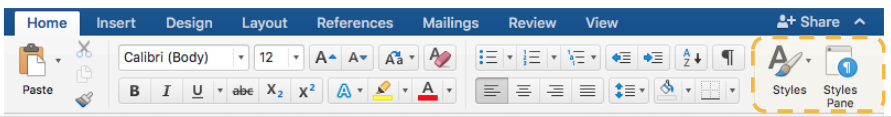
In Microsoft Word and Google Docs, the menu for assigning a role to text is called “Styles.” In Brightspace, it’s called “Format.” The standard way to use this tool is to highlight some text, click the styles/format button, and select a role for the text, e.g., “Heading 1” or “Paragraph.” Figure 1 through Figure 3 shows the location of the styles/formatting tool in these commonly used programs. (Note: Some things, like bulleted lists, have their own separate buttons in most text editor menus. It’s important to use those buttons for listed item instead of just typing out a dash or number for each list item. )
Figure 1: Google Doc

Figure 2: Brightspace
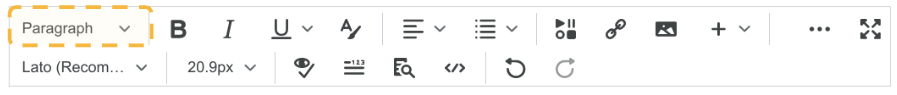
Figure 3: Microsoft Word

Headings
One of the most important formatting/styles you should use are “headings.” Headings act as labels of chapters or sections in your document that allow a student using assistive technology to jump to the chapter or section they need in the same way that other students would scan with their eyes for bigger bolder text of each section’s title. Without headings, a screen reader user would have to listen to an entire document just to find the section they need.
Headings are available in numbered levels. When you are assigning your headings, they need to be assigned in descending order of priority. Think of it like an outline!
- Heading 1: The title of the document (You should only have one heading 1 per document.)
- Heading 2: A major section/chapter of your document
- Heading 3: Sub-section of that section
- Heading 3: Another sub-section of that section
- Heading 4: Sub-section of the above heading 3 sub-section
- Heading 2: A new major section/chapter of your document
- Heading 2: A major section/chapter of your document
Resource:

Color, Contrast & Fonts
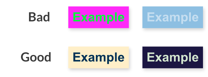
When you are picking the visual styling for your front, it’s important to consider your color combination, and in particular the difference between the degree of lightness or darkness (value) of the text to the background. Text needs to have a sufficient contrast in value between against its background color for those who experience color blindness, low vision, or need to access your content in less than ideal lighting environments. Think to yourself, if this text was printed on a greyscale printer, would there still be sufficient difference in degree of lightness or darkness to be able to read it?
In addition to the issues of contrast or color blindness, combining two very bright colors is hard for users with color vision to read. Bright colors in combination cause a “visual vibration” that can make it challenging to even look at, let alone read.
Figure 4: Good and bad examples of color contrast for electronic text
Other best practices for accessible, usable text include:
- Use sans serif fonts whenever possible, such as Calibri, Ariel, Helvetica, or Verdana, and be consistent with your font choices throughout your document.
- Ensure that the font size is large enough so that someone with low vision can read it. Generally 14 pt is adequate for regular text for nearly all fonts, but 12pt is fine for many standard fonts such as Calibri, Ariel, Helvetica, Verdana.
- Use line spacing greater than single space, such as 1.15 or 1.5.

Other Writing Considerations
- Avoid acronyms whenever possible. This can be challenging for students with reading disabilities such as dyslexia. If acronyms are used, write out and define the acronyms the first time, and consider redefining in subsequent documents.
- Do not use all-caps except for acronyms. This can be challenging for students with reading disabilities, and some screen readers may treat all all-caps text as acronyms and read the text letter by letter instead of full words.
- Avoid double spaces after end-sentence punctuation. This causes a phenomenon called “reading rivers” that can make it difficult for students with reading disabilities to keep track of where they are on the page.
- Do not use color alone to indicate information, such as “red text indicates vocabulary that will be on the quiz.”
- Numerical points should be used for ordered lists (Example: step one, step two, step three).
- Bullet points should be used for unordered lists.
- Always use program features to create lists (versus just typing out 1., 2., 3. etc.).

Text Presentation
Where and how you post your text content online for your students matters in terms of readability, usability, and accessibility. In general, you want to keep the number of steps students have to take to get to your text as few as possible.
Text less than a page
Add text directly into your course in Brightspace in the appropriate place, such as the module, assignment, or discussion description field instead of making students download a half-page Word or PDF file. In general, correctly inputted text into a Brightspace page will have the best accessibility for students using assistive technology, such as screen readers. Plus, your course will be easier to update in the future.
Text more than a page
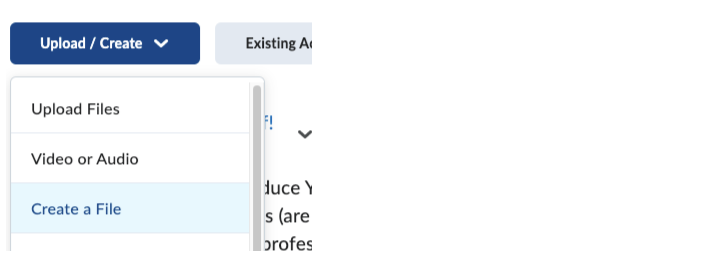
Avoid putting text directly into Brightspace’s text fields. Instead, in your course “Content,” use “Upload/Create” and “Create a File” to create a document in Brightspace.
Alternatively, consider selecting “Upload Files” to upload a Word Document that students can either view in the Brightspace page or download to read on their computer.
A whole lot of text throughout the course
Some instructors have a large amount of their own text they have written or have permission to use. In these cases, the Center for Academic Innovation can work with you to put this text into a usable, accessible format.

PDF Files
The PDF format was created by Adobe to simulate a printed page and reproduce printed copies accurately on any electronic device. Since then, PDF has become a ubiquitously used go-to format to ensure a recipient can read a document. Unfortunately, the way the PDF format was designed is not compatible with accessibility software. This doesn’t mean that PDF files can’t be made accessible, but it often takes extra effort, software, and skill to ensure that they are. The easiest way to ensure accessibility and full usability is to not use a PDF at all. Instead, you can create a file in Brightspace, a web page, a Microsoft Word file, or a Google Doc is the most hassle-free way to ensure you aren’t excluding any students.
That said, sometimes all you have is a PDF. In those cases, please try the following recommendations:
PDFs generated from a Microsoft Word file
See if you can highlight, copy, and paste the text of the PDF into Microsoft Word or a Google Doc. If you can do that, then there’s a chance your PDF might be accessible, but why not be sure and just link to your new Google Doc or upload the Word version instead? The rules from the sections above on text formatting and color contrast still apply, so make sure you apply styles/formatting to headings, bulleted lists, etc. If you weren’t able to copy and paste any text or copying and pasting resulted in really messed up formatting, see the next section regarding PDF’s generated from scanned paper.
Scanned paper documents
These are a real pain. If you have scanned PDF files, there’s a very good chance that they actually contain no electronic text at all! Instead, what you see on the screen that looks like electronic text is just a digital photograph of the original page. Besides not being accessible in any way, they take a long time to print, take up more data storage space than an electronic text equivalent, are unsearchable, can’t be used with text-to-speech tools, and cause issues for students who read and annotate text on an electronic device. Fortunately, you have some recourse:
- If you received the scanned PDF from a publisher or somewhere else, find out if they have it available in HTML (a web page) or some other format.
- If the PDF came from a full-text library database search a few years ago, search for it again, or talk to USM Libraries. The provider might have updated their files to have electronic text versions, or the library may have a better, electronic text version.
- If you generated this PDF yourself from a scan-to-email photocopier, see above, contact the Center for Academic Innovation or the Disability Services Center. We may be able to run it through some text recognition software to convert it, but depending no the quality of the scan or other formmating issues, this still make not result in an accesible document. If you have a lot of files like this, let us know, and between us, the library and disability services, we’ll collaborate with you to find a solution.
Mystery source PDFs
Send a copy of your PDF files to the Center for Academic Innovation or the Disability Services Center if you’re uncertain about their format. We’ll test them with some accessibility software to see how they perform.
PDFs generated from Google Docs
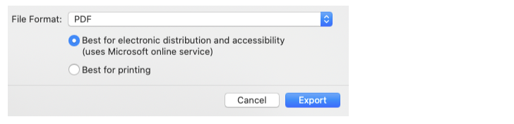
Sadly, Google Docs converted to PDF are never accessible without extra work, even when you followed the electronic text conventions above. If a PDF must be made from a Google Doc, first download it as a Word Document and make sure all accessibility considerations are met in Word. Then “Save As,” switch the File Format to “PDF,” and select “Best for electronic distribution and accessibility.” To reiterate, though, the simplest way to make a PDF accessible is not to use one at all, so consider just uploading that Word file or copying the text into a Brightspace file instead.
Non-Text Media
“Non-text media” encompasses digital images, audio, video, and interactive elements. These types of media require that various steps be taken to ensure that all students can access the information contained within them. Many of these steps are necessary for students with accessibility needs, but they will also make interacting with your course’s content better for all students. For example, any text alternative for non-text media counts as an additional form of presenting information. Also, some students find it helpful to turn video captions on to help them focus or if English is not their native language.

Alternative Text & Functional Equivalence for Images
Alternative text, or alt-text, is an umbrella term for a number of methods to provide textual alternatives to digital media. Typically, alt-text is associated with still images (.jpg, .png, etc.), but it can also be used in association with interactive media that does not provide built-in, accessible navigation. Note that if you’re using an image that is entirely decorative and irrelevant to the text, you do not have to provide alt-text, but you should follow your program’s mechanism, usually just a check box, to assign that image as decorative. Otherwise, screen readers will report that there is an ambiguous image in your content and the person using the screen reader will not know that the image does not contain any vital info.
Where Do I Put Alt-Text?
How you provide alt-text depends on the tool you’re using and how many characters you need to fully describe the function of your image. Most, if not all, software or web services that allow you to insert images provide some way of adding to the code of your image so that the alt-text is not visible on the page for most users, but available in the code for a screen reader to read out to a screen reader user. When you insert an image, look for a text field labeled alt-text, description, or caption, and put your alt-text there. Brightspace will prompt you automatically, and in Microsoft products you can find the window to edit the alt text by right clicking on the image.
If you are adding the alt-text to your image’s code through your program’s functioning, it’s important to keep that text concise. Some screen readers will not read out alt-text longer than 125 characters, so if you need longer than that to fully describe the function of your image, include that text description in the text of your document. In the alt-text field of your image you would enter “Figure 1: Image described in detail in main text following” or something similar that lets the student know that this image does have a text description, and importantly, where that is located. Similarly, if you choose to describe the image in the main text or image caption for the benefit of all your students, you would put “Figure 1: Image described in detail in main text following” or something similar into the program’s alt-text field instead of describing the image again.
Resources:
- How to add alternative text or mark an image to decorative in Microsoft Office
- How to add alternative text in Brightspace
What Should I Write?
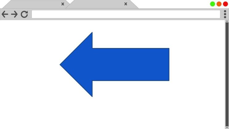
Context matters. In order to be valid, alt-text needs to be “functionally equivalent,” which means the provided alt-text does the same job as the image. Therefore, you need to communicate the same information in your alt-text that you’re using an image to communicate visually. For example, consider the simple arrow:

The “correct” alt-text for this image depends on what function the image of the arrow performs in context. For example:


Resource:
What About Charts, Graphs, and Diagrams?
As with other types of images, consider the function of that chart, graph, or digram in the context of your document, webpage, or assignment. You can ask yourself, “What is it that I am aiming to communicate with this image?” In most cases, it’s to demonstrate an overall trend or relationship within a set of data, so the functional description would describe that trend of relationship. For example, for the (fake) chart following you might write, “This scatter plot graph illustrates a strong correlation between the age of the visitor and the number of repeat visits to the website. The older the visitor, the less likely they were to visit the site again.” If it is important to the context or prominently available in the image, consider including the data points in text form with a table, as well.
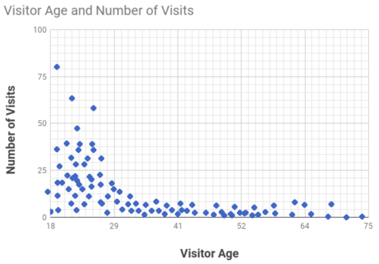
But sometimes in an instructional setting, identifying that relationship or trend is the skill you are asking your students to demonstrate, and therefore giving that functional description would “give it away.” In those cases, you include any information that a student would need to complete that task. Often that could be a detailed, literal description of the chart that will enable someone who can’t see the image to reconstruct it in their mind or through other means. So for for this same chart you might write, “The x axis, which is labeled ‘visitor age,’ ranges from 18 to 75. The y-axis is labeled ‘number of visits.’ The majority of the data points are clustered in the lower-left side of the graph with a thin line of points trailing along the x axis to the right. Interpret the graph.”
Note that in many cases you will not be able to fully describe the chart, graph or diagram in 125 characters or less. If that is the case, you will need to include this text description in the text of your document or Brightspace page. You would then input into the alt-text field in your program: “Computer User Bar Graph. Image described in detail in main text following,” or something similar.
Additional Considerations for Charts, Graphs, and Diagrams:
- Be mindful of color contrast
- Do not use color alone to convey information, consider using shapes, texture, or text labels to convey data alongside color
- Keep all information tightly together, including and especially the key
Resource:
Images of Text
An image of text is exactly that: A .jpg, .png, etc. that has what looks like electronic text in it but is instead a picture. You can tell the difference by attempting to highlight or search for the text listed in the image—it won’t appear in your search results, nor can you select it. Also, text in an image looks a little blurry around the edges compared to electronic text. If you have to use an image of text, write out that text as the image’s alt-text description.
This is Electronic Text.

Want a video tutorial on adding alternative text in some of our most commonly used programs?
Check out our One Small Thing: Adding Alternative Text blog post.

Recorded Video
If you’re using video in your course, it must be accurately captioned. If your video is from a third-party, it’ll likely have captions already, but it’s your responsibility to check before using it.
If you’re using the University of Maine system’s video hosting application, Kaltura, its automated captioning process will attempt to recognize the speech in your video and generate captions and a transcript. The good news is, Katlura’s auto captioning is very good! But, no auto-captioning is perfect so you will need to review the video’s caption file and correct any misinterpreted text within it. For simple videos of you lecturing, you may only have to make small corrections. Kaltura has instructions for their caption editor on their website.
Before you start recording, consider the following:
- Vocally describe any visual information being displayed on screen, including images and text. Your description doesn’t have to be a detailed, literal one, but it does need to be functionally equivalent for students who cannot see your slides or visual demonstrations.
- Captions are preferable to transcripts. What’s the difference? Captions appear a bit at a time in synchronization with the video, while a transcript is a file that contains the textual version of everything said. A transcript is suitable for a basic “talking head” video or audio recording, but if you’re communicating any visual information in the video that changes over the course of the recording (like a slideshow), that information may be lost or difficult to discern in a transcript.
- If you are unsure about something, reach out to us! We’ll help you come up with a plan for making sure your videos are accessible.
Resources:

Live Video
Captions are also important in your live Zoom sessions. As the host, you will need to enable caption in your settings before your students can elect to turn them on or off as needed. To enable captions for your Zoom classes:
- Log into your Zoom account through the mycampus.maine.edu or maine.zoom.us
- Go to “Settings,” then “In Meeting (Advanced)”
- Turn on “Automated captions,” ”Full Transcript,” and “Save Captions”
Resources:

Recorded Audio
Audio clips with spoken words should be accompanied by a transcript. You can save yourself time and increase the quality of your recording by writing a script before you begin recording. If you follow it closely, it can be used as-is as a transcript.
If you’re using Kaltura to record an audio clip or podcast, it’ll attempt to automatically generate a transcript; however, you’ll need to check it over and fix any misidentified words. For more information on recording audio and video, consult our Kaltura page.
Written by Michael P. Matis and updated by Rachel E. Church.
Last updated on June 12, 2023